Me myself and I!

Greensboro, North Carolina, United States
Hey! I'm Kara! Former design student (hints the post about design and drawing) I recently have taken an interest in photography so enjoy!

Sunday, December 9, 2007

Final Project! yay!


Design Journals

DT&G
This American magazine interested me because it has a verity of things too look at instead of just focusing on one thing.


icograda IDA

This Québec magazine interested me because it looks very modernized. I've always thought that countries like Quebec have a lot more class than the United states and it shows in this magazine.


The English Home


The English home kind of reminds me of the US magazine Southern Living. It's cute, I like it.

Designers

I decided to just list designers that I like because If I were to talk about their work separately I would probably sound like a broken record because I would be repeating myself so much. All of the designers below are some of my favorites. Their work is very modern and different in its own way. All of their websites are very intriguing and professional looking. I loved looking at all of their portfolio's and hopefully you will too.

P.S.- I put one designer on here that I thought was boring and stuck in the past...can you guess who?


Rachel James Interior


James Rixner Interior Design


Christopher Burns Interiors


Perla Lichi Design


Mark Sylva Designs


Design Finder


Victoria Hagan Interiors


The Ron Dayan Collection


Adrienne Chinn Design Company Ltd.


Nancy Sanford

The Design Finder firm was probably one of the most boring firm websites I look at. They didn't have many pictures of their work on their page and what the did have look really plain and boring.

Graphic/ Media Design

I don't know why but the pictures don't line up with the text, but it's in order!


This Black and white cover is simply yet will make you want to buy the book after looking at it. It's classy and elegant with a display of great photography on the front, big enough to see.


This cover has a creative vide to it. I like different things that are put together to make one thing look complete and thats what they have done here.


I don't really know how I feel about this cover.
It's almost too simply to be a book cover. I think if they added some more lines and color contrast it would be more interesting.


I love love LOVE this cover! It's so neat looking! It doesn't have much color, but I don't think it needs it. I wouldn't change a thing about this cover!


This cover to me gives off a 70's vibe for some reason. I like it because it's vibrant with color, but then I don't like it because I think it's kind of busy.


This cover reminds me of my old high school english text book. Thats never a good thing.


I like the idea of having the pictures faded out around the edges, but I think the picture on this cover could have been a better one. This one is kind of boring looking and I think the text should be more interesting as well.


This cover reminds me of like a journal cover, so if this book is based off a journal than I'd say it's better good. If not, than they need to pick a new cover.


I love this layout! I think it's very simple and modern. The only thing that I would probably do different is change the pictures. I feel that they could of been better.


I like the color combination on this cover, but thats about it. Think the layout was poorly done and the title should be bigger.

Saturday, December 8, 2007

Produces/ Artifacts


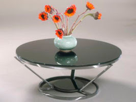
This table is very modern and sophisticated. I could easily see myself putting this table somewhere in my house. I don't really see this table in a living room or game room because I feel it gives off a more formal feeling. I think that this table should be put in a room that's rarely used, such as a sitting room.


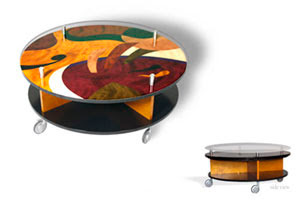
I love this table! I would put it in my family room if I had a house and a family of my own that is...I think that this table is so funky and fun and modern! The only this I would probably change about it are the wheels on the bottom, there's something about them that bothers me but I can't figure out what.


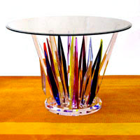
I thought this table was very interesting. I have never seen anything like it before. It's very vibrant and colorful so that's part of the reason I like it. Again, it's very sophisticated and I could see it being in a high class Manhattan, New York apartment having cocktails being placed upon it.


I could see this bar stool/table set being in one of my future apartments. I thought it was very modern and would love to sit at with a good friend (or boyfriend) and eat dinner.


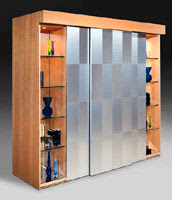
I don't know why, but I'm always attracted to things like this. I think it's because I like furniture with compartments and storage. The only thing about this piece that I don't like would be how they have so much of it blocked off and just have some selves on the side. I think I would of liked to seen that big sheet of frosted glass or whatever it's made out of split of into more sections to even it out with the selves on the side.


I picked this light fixture because it reminded of my of my mom in a weird way. Whenever I see that combination of colors I think of my mother because she always decorates in those colors. Being my mother's daughter we have similar taste so this light fixture would be ideal on a wall in ether mine or my mom's house. I like how the shape of the glass is shaped like a big wine glass. That shape has sophisticated and classy written all over it.


I like this light fixture and how it doesn't really give off light but more of a glow instead. Of course you wouldn't use it as a reading light or something that requires a bunch of light. I think it would be used as more of a decoration that for the purpose of light. The phase "just sit there and look pretty" comes to mind when I look at this piece.


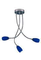
This is the ultimate kitchen table light! I know when I have a kitchen table of my own I would love to put this type over it. The shape makes it relaxed and fun, unlike the every day kitchen table light that is usually a chandelier of some sort.


This fixture I can see hanging over an island in the Kitchen. It gives off just enough light to do what you need to do, but at the same time doesn't over power the room with a massive amount of light.


COMPARTMENTS! and lots of them!...Don't get me wrong I know I said I love compartments and storage earlier, but this could be a little much now that I think about it. This piece would probably look best in a section of a small store like a coffee shop of some sort.

THINGZ

Buildings


Magistrates' Court holds an interesting shape to it. It's very old timey looking and I love to look at old buildings and see the procession that has been made by architecture today.


The Black Friar
is kind of run down looking, but I like it for some reason. I can see myself fixing a building like this up and renting it out a small apartment of some sort.


1 Poultry is a little much for me. You have this already weird building structure and then to add to it you have horizontal stripes all the way around and up and down. No thank you, not for me.


The Gehry TowerI love how this building is so out of place with it's rotated side. I know if i was walking down the street and saw this building I would stop and take in the uniqueness of it in.


The Walt Disney Concert Hall. My first word when I saw this building ..."wow." There is not a single thing I would change about this building. The architecture's amazing, the lighting is perfect, and the amount of creativity definitely shows. Bravo!


The John Hancock building is also very beautiful. I think I like it because it's beams that go up the side of it remind me of a big water tower or something. It's definitely a site I want to see in person.


I think this building is called the Green Building, but I couldn't resist putting in it on here because it's one of the few building that has color and looks like some creativity was incorporated into the design of it.


St. George's Hall is an absolutely beautiful building. It reminds me of a cake in the night with the top part lighting up like frosting on a cake.


Empire State Building. How could you not LOVE this building. It's the tallest building I know I have ever seen and the view from the top is amazing. However, I do feel like it might be a little plain and might need some what of a creative boost from the 21st century.


The Lamborghini Building caught my eye because number 1 THERE'S A CAR ON THE SIDE OF THE BUILDING! Number 2, you usually don't see building shaped like that and I thought it was really interesting. I wonder why they chose that shape? Number 3, THE CAR ROTATES FROM THE OUTSIDE TO THE INSIDE!

Design Frim and Organizaton Websites


This website is overwhelming. I find it hard to navigate and understand. It would of been much easier to know what to do if everything was big and clear up at the top like most websites usually are.


Interior Design


This website was easy to navigate through, but I thought it was kind of plain jane. I think it could have used some major color.

A2


This...is probably the coolest website I have ever seen in my life! It's easy to follow and it makes cool noises when you push something! I love this website and encourage whoever reads this to check it out!!


Karim Rashid


This website is border line of being too simple. Although I think this website makes you focus on the most important thing. The work of the company. You can see it come to live when you run your mouse over it and the black and white picture turns to color. Very neat.


Aleks Istanbullu Architects


I have one word to sum up this website... BORING!!!! boring boring boring!...There are no pictures and there isn't any color what so ever. I feel like I'm looking at one of my history teachers power points for the lecture of the day.


Henrybuilt


I like this website. It's easy to follow, they have a verity of their work on the main page big enough to see. Very nice.


Officewraps


This website's ok. I feel that it's not up to date with technology and that it would probably make a big difference in their company if they updated it to show off their work in the best way possible.

Rice's Cabinetry


I think this website could of used bigger pictures of their work to see. I think the main page should always so some sort of work and have it be big enough to grab somebodies attention.


Innovative Spaces, INC


I loooooove this website! I think i like it so much is because I love their work so much. It's easy to navigate and it shows one thing that most of the other websites I've looked at haven't. They show the process of their work and I thought it was kind of neat that they did that since we're all about the process at UNCG.


Glass Innovations


Nancy Sanford is a designer from Denver, Colorado. Her design studio opened in 1995. Nancy Sanford Design Studio's website has a very simple set up. The navigation of the website is easy to follow and is very basic. She has everything you would need to know about her and her work such as a profile, services, press and articles about her and work, her portfolio, and how to contact her. I thought it was really neat how her work in her portfolio was a slide show and from the look of it she does some really modern and abstract work.

http://nancysanford.com/

Sustainable Design

I'll just start off by saying that all of these pieces are amazing and I'll probably be repeating myself a lot


This color is so vibrant and full of life! I love this bed! Although, I don't think I would wanna sleep in it. It doesn't look to comfy.


However, I could see myself taking a couple of naps in this chair. I'd rest peacefully knowing that I'm helping the earth because I bought the chair that's made from natural resources.


I would probably put this chair in my living room (if i had one that is) It'd be perfect for a formal setting in a room.


This sofa I do believe would be going in front of the TV along with the recliner so I could take naps on both of them after an a crazy day at the studio...It looks so comfy and cozy! LOVE IT!


This chairs are so cool! They're very neat and abstract. I could see these chairs in a funcky living room or out on a screened in porch.


This two chairs to me are kind of plain and boring, but they're saving the earth so that makes them AMAZING!


This chair...will be going on my back porch overlooking the mountains one day. It has that red that will pop and that texture that make you wanna sit down and enjoy life.


Again, I love this bed, but it doesn't look comfortable to me and thats a very important quality for me when it comes to me and beds. If you haven't noticed already by the nap comments, I like to sleep.


From looking around online and reading articles I have summed up what sustainable design means to me. It's designing something that will be able to be environment friendly and will be preserving what we have left on this earth. Some have called it "Green Design" which if I must say would be a proper name for it considering it's all for the cause.

Sustainable Furnature